Client
Board of Pharmacy Specialities
Project
Website redesign
Project Description
BPS is the premier post-licensure certification agency for pharmacists. It improves the lives of patients by providing certifications and accreditations to pharmacists in specialty areas.
The Challenge
BPS’s original website featured an overwhelming amount of text and oftentimes caused visitors to assume the organization itself was a pharmacy. The website’s design was also bland and uninviting and lacked color, images, and graphics.
Project Specifics
-
Website design
-
User Research
-
UI/UX Design
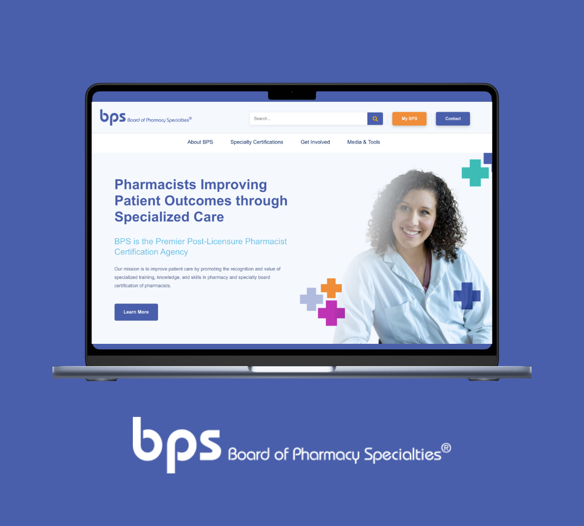
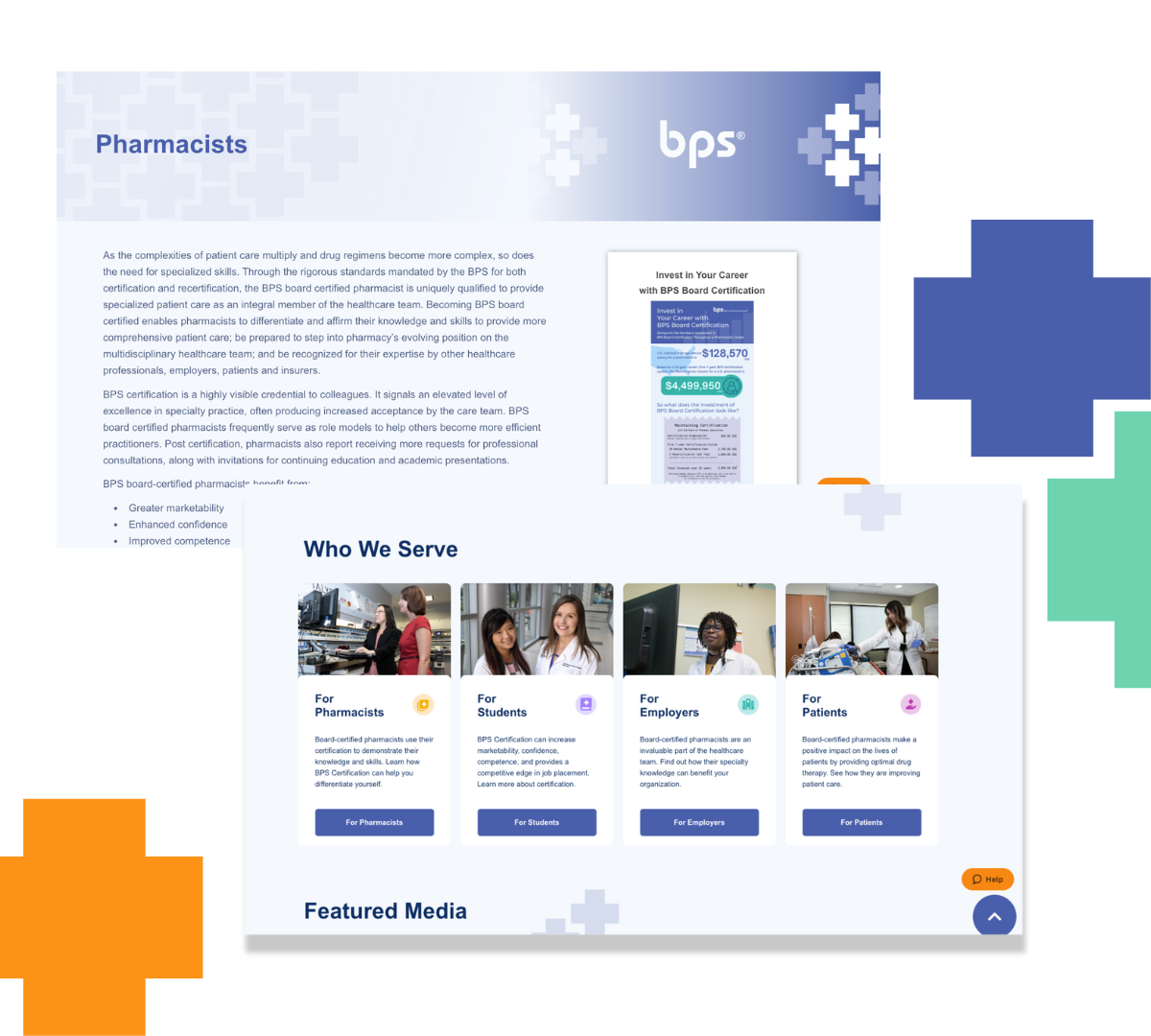
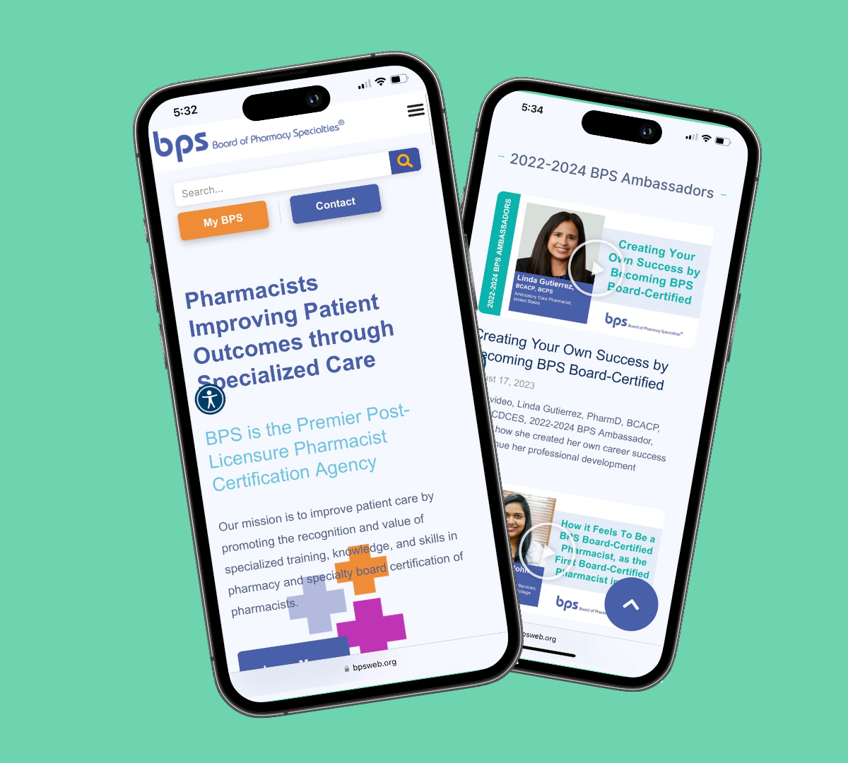
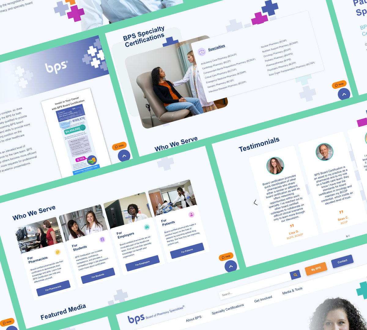
We created a website for BPS that streamlined its content and featured visually engaging layouts that made the purpose of the organization clearer.
Our Solution
We started with simplifying the site’s wireframe and combining pages where we were able to. By editing and trimming written content, we kept important messaging and ensured that users could more easily navigate the site. Then, we designed new page layouts that incorporated BPS’s brand colors to make the pages more inviting. Adding features like CSS and third-party plug-ins on the back end gave BPS the option to add new pages in the future with a non-technical staff.

